CanCred Factory updates its interface for a better user experience
CanCred is continuously evolving to deliver the best possible experience to its clients.
This latest update to CanCred Factory reflects that ongoing commitment, bringing a series of focused improvements to the platform’s interface — refining navigation, modernising the overall look and feel, and making everyday workflows even smoother. The planned changes include a platform-wide footer, a lighter dashboard experience, a reorganised Admin menu, and clearer access to advanced features — all while keeping the platform familiar for current users.
For organisations using digital badges and digital credentials at scale, these kinds of improvements matter. When key actions are easier to find and the interface feels more intuitive, teams can manage badge workflows more efficiently and with less friction.
Practical improvements for everyday badge management
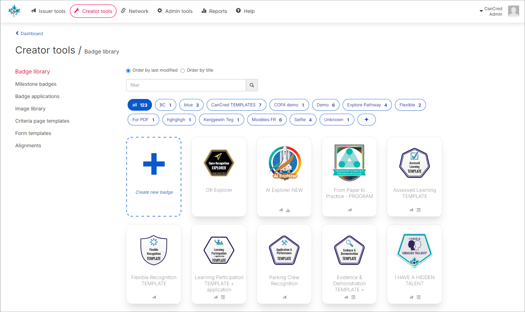
CanCred Factory helps organisations create, issue, and manage digital badges, Open Badges, and broader digital credentials. This update focuses on the parts of the platform that users interact with most often, enhancing the experience without disrupting familiar workflows.
What is changing in CanCred Factory?
The update includes a series of practical improvements that make the interface feel lighter, more consistent, and easier to navigate.
Better visibility into available features
The enhanced features only accessible at Premium and Pro are now presented more transparently. Rather than simply blocking access with an unavailability message, the interface will show these features in preview mode — with reduced opacity and a message explaining the service level required for activation. This helps organisations better understand what is available on the platform and what they can unlock as they grow.
A fresher and more modern look
The update also brings visual refinements across the platform — improved top navigation spacing, reporting screens, issuer tools, and dashboard layout — alongside the addition of a footer on every page. Accessibility considerations have also been part of this update, with improvements that contribute to a more inclusive experience across the platform.
The result is an interface that feels more polished and balanced while remaining fully familiar to existing users.